In the above photo, I’ve found a solution for using thin Japanese papers for monotype. The paper has to be dampened or the watercolor won’t transfer when printing, and the dampening turns the paper outside the printed area into a crinkled mess. I decided to cut the paper down to the 4″ x 4″ printed area and glue it to a larger sheet of paper with wheat paste. This was a pretty faint ghost monotype to begin with, and the watercolor doesn’t seem to have bled at all during the gluing process, maybe because I dampened the backing paper and not the print. Obviously it would make more sense to skip the Japanese paper and use a paper that’s better suited to monotype, but part of the 365 challenge is using up all of the paper I’ve accumulated over the years in lieu of buying new supplies.

Monotype no. 20 with ghost: water based Charbonnel ink painted on zinc; reductive print. This 12″ plate did indeed fit in my tiny tabletop press, but didn’t allow very much room for paper margins. Maybe I’ll try this plate again as a bleed print without borders.
Monotype no. 22: dissolved Aquarelle crayons painted onto plexiglass, printed on Rives BFK paper. Don’t forget the proper orientation of paper to plate unless you want to feel like a first semester printmaking student. It’s not uncommon to see a trace of gum arabic in the background of the finished print, but this is really quite unsightly:
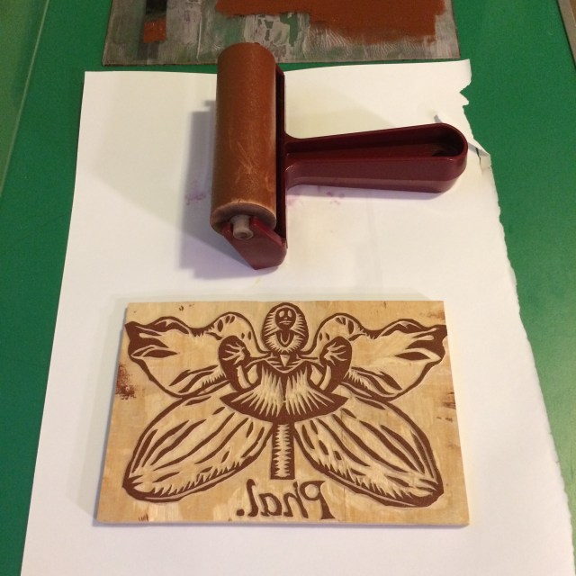
Below is the wood block I’ve carved that will be printed on top of the monotype.